Client: Definition Records · Leipzig
·
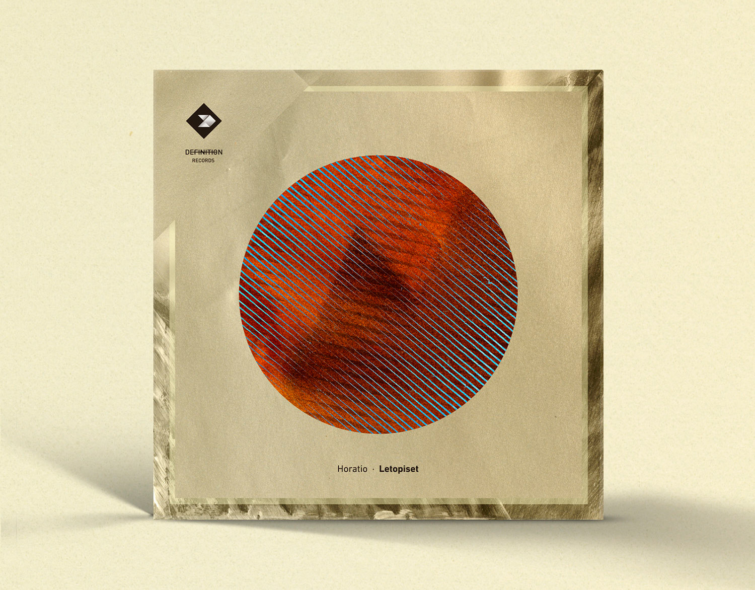
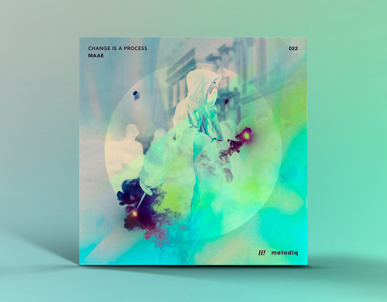
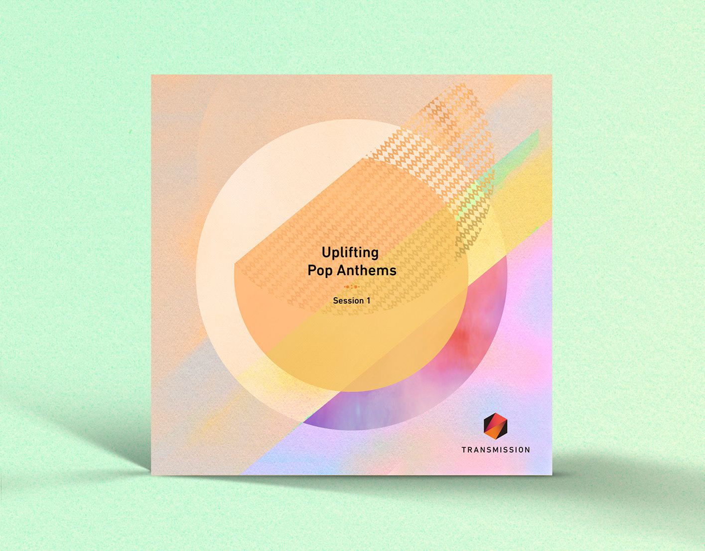
After the first collection of 25 covers, this label decided to have a complete refreshment of their Visual Identity & Branding, uniting their deep Techno & Underground’s roots with a more elegant and futuristic visual aesthetic.
·
At first, this client only wanted the “old icon with a new body,” so I began by finding its “geometric proportions” to redesign it. Still, while working intensely on this, new concepts emerged, and the project leaped forward in a new and even more exciting direction.
The new icon is a metaphor inspired by the label’s vision (“Its all about Music”), by the concept of “rhythmic & progressive movement” and by the universal icons of the “play” and “fast-forward” buttons.
·
On this page, you can see the evolution of the Branding process.


